
Allow me to start this article with a question: when you build a model in Power BI, do you think about the usability of that model? Rephrased, do you think about the user who is building a report on top of your model (including yourself) and the experience of that person while working with your model?
We tend to think of user experience when we’re designing the reporting layer because with most Power BI solutions, the reporting layer is where a majority of the usage occurs. Makes sense. In my experience, however, the data model layer often does not receive the same UX considerations but I believe that it should. A well built model is capable of supporting multiple reports, those reports likely being authored by more than one person. Additionally, it’s become an increasingly common practice in Power BI solutions to create separate .pbix files for the data model and reporting layers. If we follow this approach, it means that report authoring is done in a different file than our model and the report author isn’t able to view all of the details of the model, like the DAX behind measures or calculated columns for instance. So, it’s on data model developers to make the models as user friendly as possible. This is accomplish with implementing user friendly naming conventions, capturing metadata in the model, and applying appropriate formatting across columns and measures.
I tend to think of this data model UX work as prepping the wrangled data for visualization, so a good time to accomplish this work is while loading data to the model. With the exception of implementing naming conventions, I like to lump all of this work together in parallel and step through each table in the model, one at a time.
Naming Conventions
I think that we tend to be more concerned about naming conventions as we develop the reporting layer. Seeing the text in axis labels and titles and legends highlights the names. And when we see something we don’t like, the tendency is fix it on the reporting layer, right where we see the problem. Acceptable. I’ve done that many times and almost every time, caught myself having to rename the same column or measure on the reporting layer multiple times. Inefficient. So, I’d like to suggest implementing user friendly names at the model layer. This approach allows the name to be set once and remain consistent across any visual or any report that connects back to this model. And if you, as the developer, are releasing the model for use by other analysts or business users, translating object names from the data source names to more user/business friendly terms makes the model easier for them to work with. In general I like to keep names descriptive but as short as possible. A name that can be used as an axis title or table column header, for example, without having to rename it in the reporting layer for clear communication.
I recommend implementing your naming conventions as early as possible in the model development, preferably before creating visualizations. Power BI is gracious in that DAX will pickup naming changes to tables, columns, or measures, but visuals don’t. So if you create all your visuals then rename your objects, those visuals will break and you’ll be stuck with fixing them. Not fun and potentially very time consuming.
When I implement naming conventions, I do this either in Power Query and/or SQL views. If my organization allows friendly column names in a SQL views, I’ll implement there. If I’m using a table in multiple models, my naming convention is already in place and the work is done. Not all organizations allow this and that’s ok. In the case where I can’t use a view, I’ll rename the columns in Power Query. No matter how I rename the columns, I use Power Query to rename tables.
Here’s a few other tips to consider as you are naming objects in your model:
- Spaces are ok! Actually, spaces are encouraged! Add spaces to table and column names just like writing everyday, normal language. Replace _ (underscore characters) that served as space substitutes in the data source with spaces where appropriate. Spaces make names more readable and the names will present better in the reporting layer. An exception here would be for bridge tables, helper tables, key columns, sort columns or any other object that you may want to hide in your model. Leaving the spaces out indicates that something is different about these objects and that they’re not intended for use in reporting.
- Remove database specific naming elements. Words like fact, dim, view, vw, or schema names. These elements are needed at the database level but don’t bring value to the data model or the reporting layer. Plus many business users probably don’t know, or don’t need to know, what a fact or dimension table is. As an example, factSales could be named Sales, dimCustomers named Customers.
- Be consistent with the terms in naming conventions. Find what works well for you, your users, and your organization and stick with it. If, for instance, you have a table with addresses of customers and another table with addresses of vendors, don’t use Zip Code on one table and Postal Code on another unless the requirements state to. Consistency is particularly helpful with DAX measures. If you’re using a $ instead of writing out Dollars, use that symbol for dollars all the time.
Formatting
Applying intentional and consistent formats to number, currency, and date data across the model is simple but has a big impact on the reporting layer. If your organization has requirements for how these data types are formatted you’ll certainly want to follow those. Not every organization has formal requirements, but many organizations do have preferences here. Knowing these requirements or preferences up front is helpful, because it allows the formats to be baked in as the model is being built. A few things to consider here:
- How does the audience like to read dates? I like to start with MM/DD/YYYY, since it presents nicely in tables, and adjust from there.
- Should currencies include the currency symbol?
- Should negative numbers be signified with a – [minus] or enclosed in parenthesis? Is there a difference for currencies?
- Include the thousands comma separator for all numbers unless the requirements state otherwise.
- How many, if any, decimal places should be used in numbers? Percentages? Currencies?
A little time setting up these formats up front can save you time when building out visuals. There’s no guarantee preventing future adjustments, but small adjustments are always necessary.
Metadata
I know, I know. Metadata is a broad word. In working with data models, metadata comes in the form of additional properties on measures, columns, and tables to help Power BI know how to display our data. It also means capturing information on our data to communicate what kind of data exists within different objects in the model. Let’s expand on these a bit more:
Descriptions
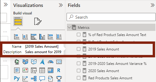
This aptly named property is useful when a table or column name isn’t enough to describe the data held within that table or column. A column name like “Date MM/DD/YYYY Format” is descriptive but not all that useful on the reporting layer. That column would almost always get renamed when used in a visual. Naming the column “Date” then entering the description “MM/DD/YYY format” is better. The column name is helpful and it’s easy for the report author to know about what this column looks like before they use it. I don’t often need to use descriptions for every table or column, but descriptions really shine on DAX measures. I like to use the descriptions on measures to document the measure definition in plain language, and to include any formula logic or business rules as relevant. Something like “Sales Amount for the current year minus Sales Amount for the previous year”. Something that provides all of the context about that measure, how it should be used and in what scenarios. A good description helps any user verify that they’re selecting the correct data or measure for their report. In models with many DAX measures, these descriptions are invaluable. Even if you wrote all the measures, it can be hard to remember what each one does specifically, especially when you follow best practices and break the measures down into smaller chunks or there are measures that are similar (says the author from experience!)
Descriptions can be captured for tables, columns, and measures in the Model view in Power BI Desktop, in the Properties pane.
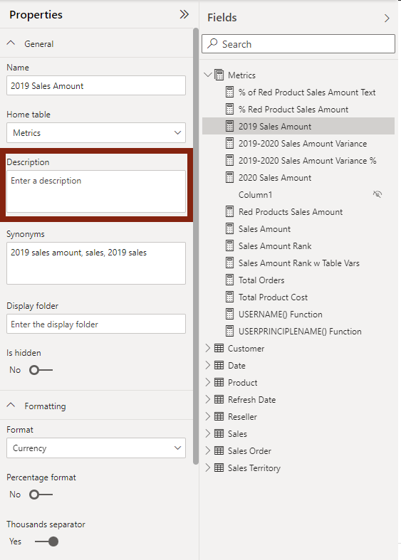
These descriptions are exposed anytime a user hovers over the object in the Fields pane.
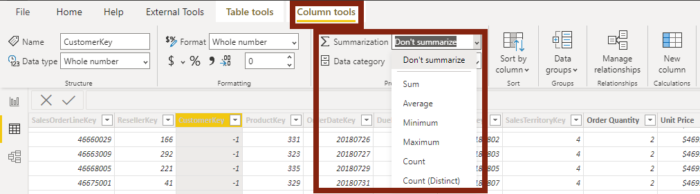
Summarization
Summarization is a column specific property that allows you to specify how the data in a column is aggregated when used as an implicit measure in a visual. “But wait!” you say. “We should be writing explicit DAX calculations instead of using implicit calculations.” That’s correct. By setting the Summarization property we’re not encouraging implicit measures, but rather, we’re making sure that the data is getting aggregated (or not aggregated) in the correct way if an implicit measure does get used. In other words, explicit DAX measures are preferred, but the Summarization property should be set to cover the instances where implicit measures get used. I mostly like to set the Summarization property so that data that shouldn’t get aggregated doesn’t. Here’s some guidelines to get you started:
- Set Key columns to “Don’t summarize”. These columns are almost always going to be hidden and not used in reporting anyway, but in the rare instance that they do, a key isn’t going to need aggregation. Write a DAX measure to aggregate the key if you need it.
- Set year, quarter, month, or day numbers to “Don’t summarize”. These are often numeric data types so Power BI assumes that they should be aggregated.
- Choose the most appropriate summarization for each column that should be aggregated. For example, “Count (Distinct)” for a Customer ID or “Sum” for Sales Amount. You may want to choose “Don’t Summarize” for columns like Sales Amount when they will be used in table visuals frequently, say, when showing invoice line items with the sales amount. These instances may vary in your use case so use your best judgment.
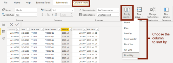
Sort By Column
The Sort By Column property is another column specific property. It does exactly what it sounds like: sorts the column you’ve selected by the column you specify in this property. This property can have many use cases, I find the most common use case on Date tables to sort date attributes, like month names, in calendar order instead of alphabetical order. Once the Sort By Column property is set and you use the column in a report, Power BI sees the mapping and will sort the column in your visual just as you set it. Keep in mind that a sort by column can only have one unique value for the column you’re trying to sort. So, if we’re sorting month name by month number, January needs to map to month number 1. If Power BI sees a month number 1 and 2 in rows where January is the month name, an error gets thrown. Don’t be discouraged when the error pops up. Once you set the property a few times, you’ll get the hang of it!
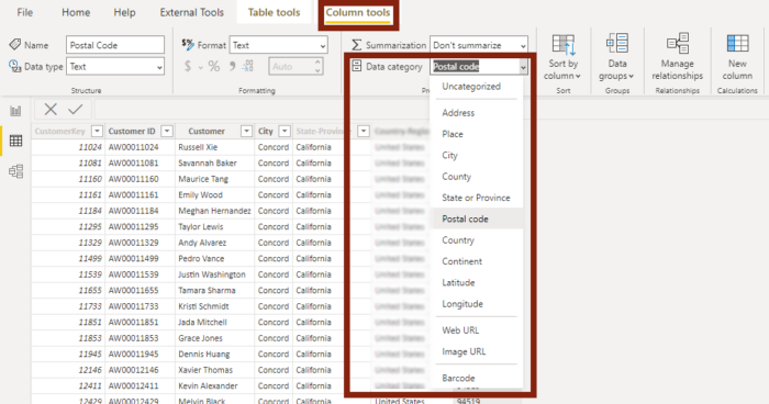
Data Category
The Data Category property gives Power BI more information about data in a column so it knows what to do with the data when visualized. Think about “AL”, for example. These 2 letters can mean a number of things: American League, the state code for Alabama, the country code for Albania, or a code from a business system. If we know that “AL” in our dataset is the state code for Alabama, then we ought to let Power BI know so that it does not have to make assumptions about this data in our visuals. Sometimes Power BI assumes correctly, but that’s not always the case.
Most of the available data categories are geographic with exception of Web URL, Image URL, and Barcodes. The geographic categories map very logically.
When Power BI sees data categorized as a Web URL, the data gets visualized as a hyperlink, linking to whatever URL is captured in the data.
When Power BI sees data categorized as an Image URL, capable visuals will actually display the image found at the URL in the data.
I recommend using any and all of these categories where appropriate in your model.
Hiding Objects in Report View
Our models often contain objects that are necessary for modelling, sorting, or other utilitarian purposes but are not objects that ever need to be exposed in reporting. The last tip of the article is to declutter the model by hiding those objects. Here are some starting points for objects to hide:
- Dimensional key columns
- Sort columms
- Bridge tables
- Helper or Harvest measures
- OPTIONAL: Columns that have been aggregated in DAX measures. This can direct report authors to utilize the DAX measures, which can make sense in certain situations, but not always. If you do go this direction, make sure your measures have appropriate descriptions in place.
All tables, columns, and measures are visible when created and have to be hidden manually if desired. Once hidden, hidden objects are not shown in the Report view. It is possible, though, to see those items if necessary. There’s a couple of ways to do all of this in Power BI Desktop, in the Fields pane, and in the Model view in the Properties pane:
| Fields Pane | Model View Properties pane | |
| Hide Objects | Right click on the object and click “Hide” | Left click the object and toggle “Is hidden” to Yes |
| Unhide Objects | Right click on the object and click “Hide” to remove the checkmark next to “Hide” | Left click the object and toggle “Is hidden” to No |
| View Hidden Objects | Right click anywhere in the Fields pane and click “View Hidden” – Hidden objects are indicated by the slashed out eye icon. | Hidden objects are shown always shown in the Model view , indicated by the slashed out eye icon. |
In Closing
I hope you find these tips useful in your model development. In the next article, we’ll take a look at two elements that we can add to our reporting than give end users greater context about the data in the reports.