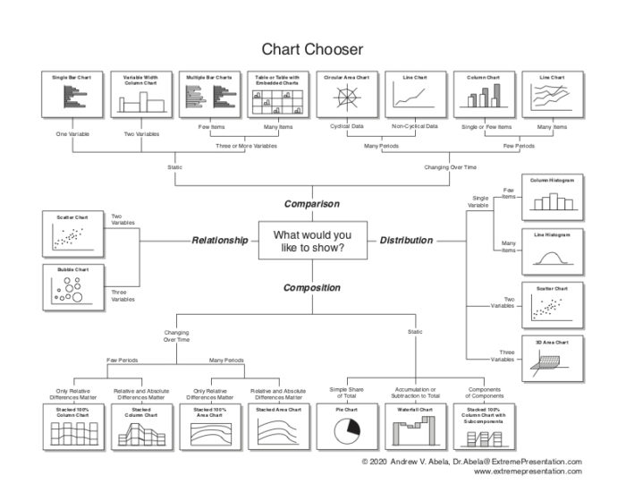
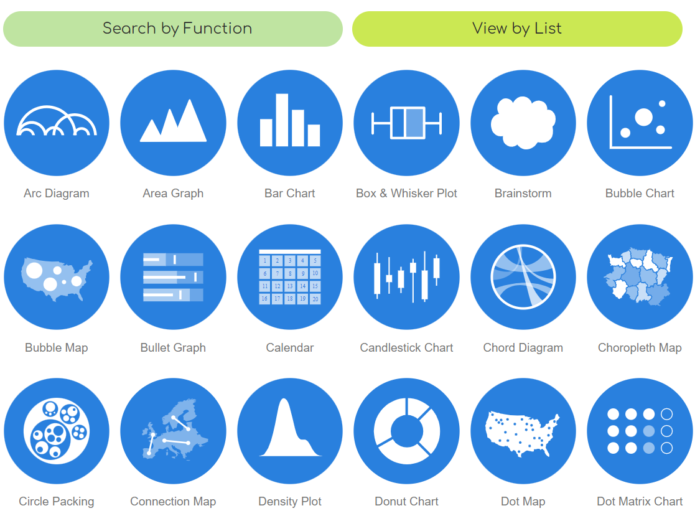
Chart Chooser
by Dr. Andrew Abela
This image/PDF has been floating around the internet for several years. It serves as a great starting point anytime you need to create a visualization for any type of data project
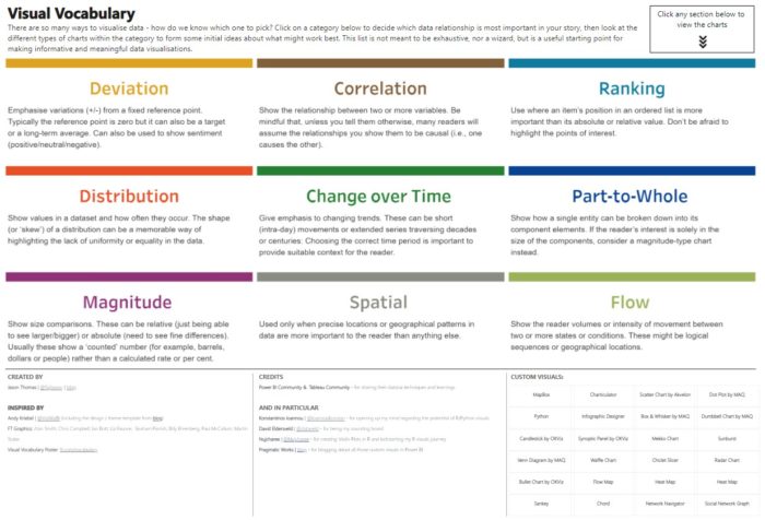
Financial Times Visual Vocabulary: Power BI Edition
by Jason Thomas (SQLJason)
This is, perhaps, the nerdiest Power BI report ever! I particularly like the interactivity. This is also helpful if you’re working on a Power BI project because the charts are presented as you will see them when working in Power BI. SQLJason has also written a blog post here that further explains the inspiration for this project.
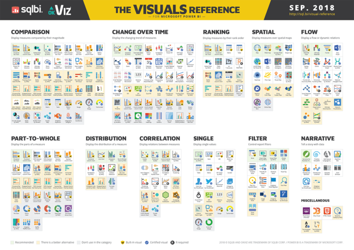
Power BI Visuals Reference
by SQLBI
I really like this chart for folks who are new to data visualization working in Power BI. Although the chart really only applies to Power BI, I like that it includes the out of the box visuals as well as many of the custom visuals available.
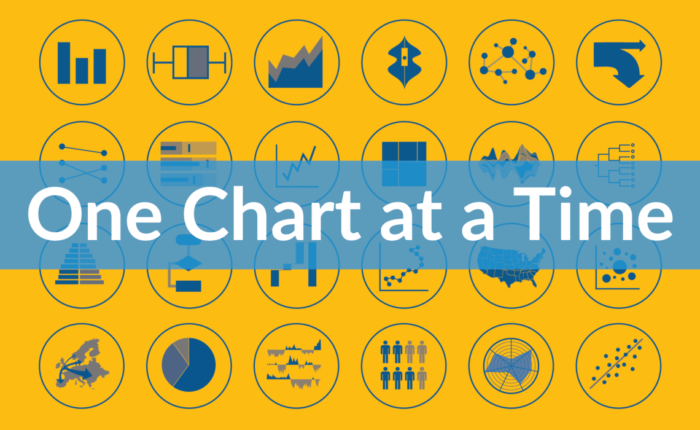
One Chart at a Time
by Jon Schwabish (PolicyViz)
Great video series with over 50 data viz practitioners and experts taking 5-15 minute deep dives into several chart types. I learned a lot by watching these! If you’re interested in expanding your data viz knowledge then these are certainly worth watching.
The Data Visualisation Catalogue
by Severino Ribecca
Great, easy to use site with explanations on all types of charts used in data visualization. Check out the additional resources too, this site is more than just a catalog of charts.