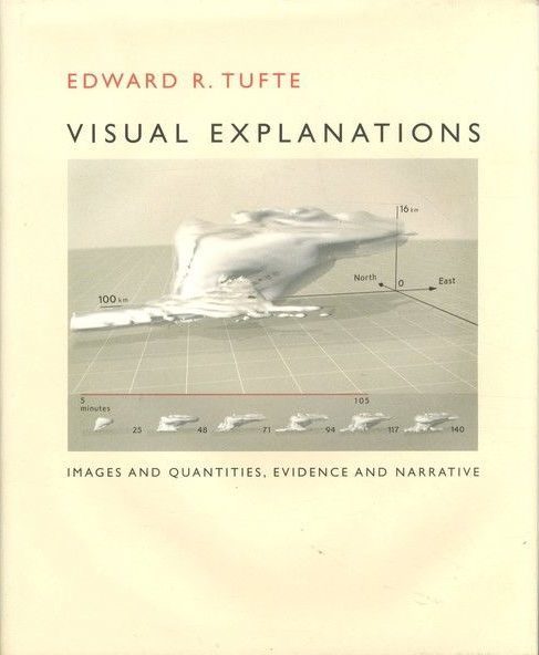
Visual Explanations is the third in Tufte’s well known quartet of books on information visualization (The Visual Display of Quantitative Information, Envisioning Information, Visual Explanations, and Beautiful Evidence). This is also the third of the quartet that I have read- I have yet to read Beautiful Evidence. I found the book somewhat interesting overall, but it is my least favorite so far.
Let me explain a bit more. There wasn’t as much “new” content in Visual Explanations as I had hoped for. Many themes from The Visual Display of Quantitative Information and Envisioning Information were covered again here, such as the concept of paper being a flatland, minimizing non-data elements in a visual to make it easier to read, and small multiples. I also found some of the new content hard to get into, for example, chapter 3 titled “Explaining Magic: Pictorial Instructions and Disinformation Design”. The chapter focuses on disinformation design and uses instructional graphics for magic tricks, which are all about illusion and slight of hand, to display what not to do in information displays. There are some good examples in the chapter, and it’s a clever way to make the point, but I’m not a magician so I had a hard time relating to the content. I found Cole Nussbaumer-Knaflic’s Storytelling With Data to contain some of the same ideas with more relevance.
You should know that I hardly find reading Tufte’s work a waste of time. The details of his books are beautiful. The pages and binding are high quality. Images are positioned in line with text so that, as Tufte teaches in data viz, the reader does not need to bounce back and forth between the image and text descriptions. The images are clean and easy to read. Reading Tufte’s work is delightful because of this attention to detail.
What I Learned
Upon reading the first few pages of the book, my excitement grew. I had not anticipated looking at examples of information visualization in forms like photography, art, or architectural diagrams but the author informed that these forms were to be found in the coming pages. Great! I know that art conveys a message but I had not stopped to consider the use of a photograph as a method for communicating data or that an artist’s message is indeed information. Tufte used many examples outside of typical charts or tables throughout the book: including The Urge to See by Josef Koudelka (pg. 13), Designs for the Pavilion at Brighton by Humphry Repton (pg. 16), and Self Portrait: The Constructor by El Lissitzky (pg. 140). Seeing examples such as these opened up a new way of thinking about data viz for me. While I don’t work beyond the typical charts, graphs, or tables used in BI much, I really look forward to seeing how this affects my creative thinking in the future.
The biggest takeaway from the book, for me, was Tufte’s contrasts between John Snow’s work on the spread of Cholera in London in 1854 and the launch of the space shuttle Challenger in 1986. Several pages are dedicated to looking at how data was obtained in both of scenarios, how that data was analyzed, and finally how the data was subsequently presented, each scenario with very different outcomes. Dealing with data carefully and accurately is key in our line of work, especially when our work will lead to key business decisions, inform or disinform a reader, or in the case of the book’s examples, lives are at stake. Snow’s process resonated with me and I feel reinvigorated to put in the work necessary to consider all angles and to get the data right when developing a new report or visual.
In Closing
My position on this book is pretty neutral; I don’t highly recommend the book but I also don’t discourage you from reading it either. Although I learned more from Tufte’s previous two books, I am glad to have read the book because I believe that it has opened some new creative potential.